Posts

Showing posts from 2018

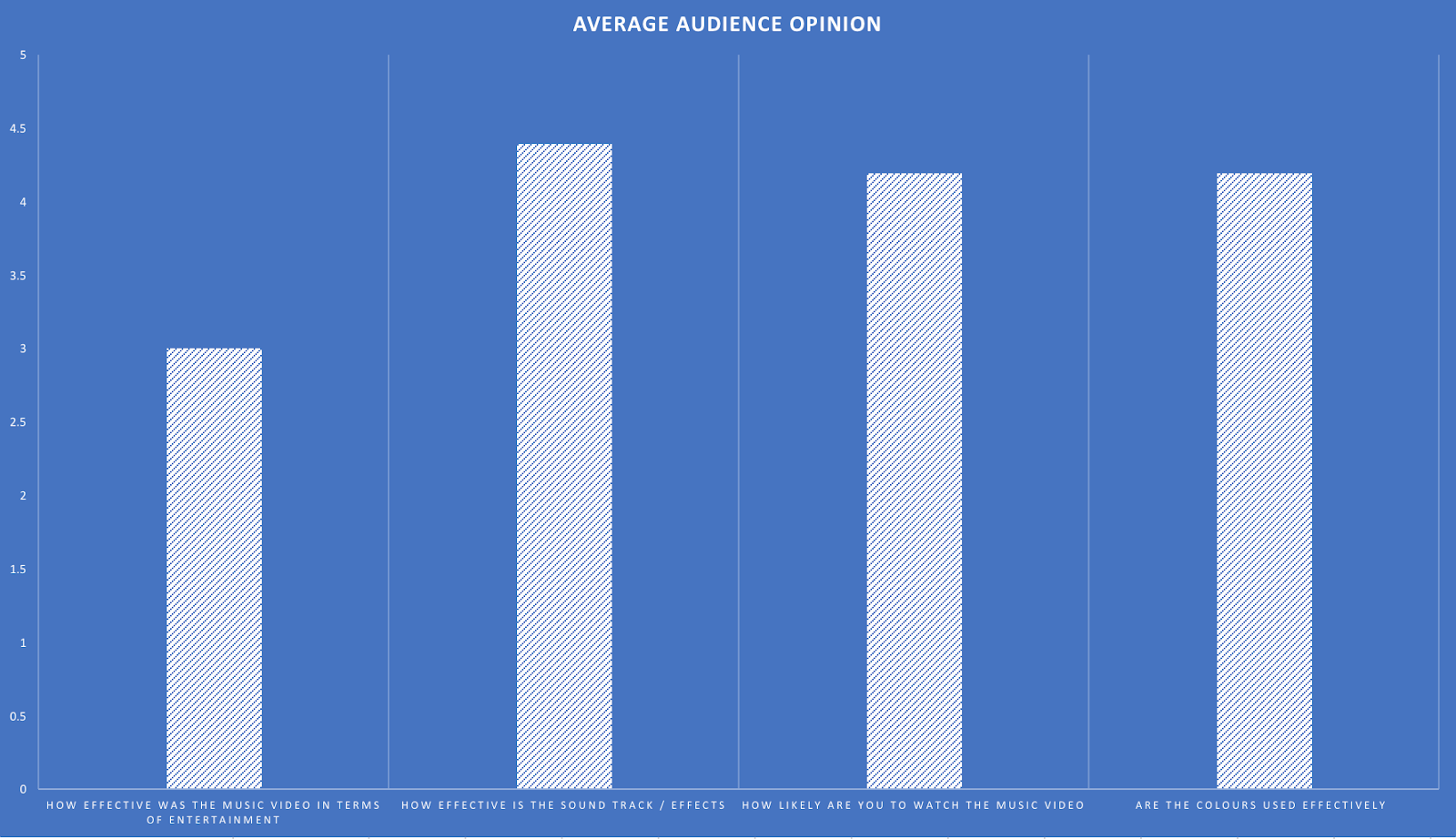
Message to Moderator

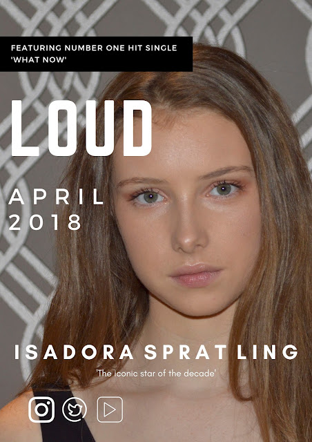
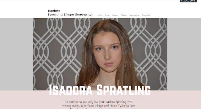
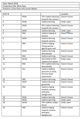
Dear Moderator, My name is Lauren Mason, Candidate Number: 1611 and welcome to my OCR A2 Media Studies blog. This is a record of the work undertaken as part of the G325 A2 Advanced Portfolio within the OCR GCS course in Media Studies. I worked with a partner - Grace Ryan to produce a music video in the pop genre. The project lasted six months, commencing in September 2017 and finishing in March 2018. I hope you enjoy my work and find it both successful and interesting. Please use the navigation bar to access my work as organised into the labels: Preliminary Task, Research and Planning, Filming and Editing, Website Research, Magazine Advert Research, Audience Research and Evaluations. I have also linked the School's blog hub and my other classmates' blogs. Thank you & enjoy,  Lauren Mason

Music Video - What Now

Image
Here is my music video, created with my partner Grace:

Ancillary Task 1: Magazine Advert

Image
After creating two different Magazine adverts on canva we showed a number of people and received some audience feedback. We were told that they didn't like the font of the title as it didn't really fit with the genre or aesthetics of our music video, however we also learnt from our audience feedback that the writing in the first option covered to much our the image and in particular the artists face. Subsequently, we used the good aspects of both and combined them creating a magazine advert out target audience liked.

Ancillary Task 2: Website

Image
Using the website 'Wix' we created a website as part of our ancillary task. We found using the website very effective as well as easy to use. We were able to choose from multiple templates which we could then edit to fit the synergy and style of our product, by adding slide shows, images, personalised text and music. here is a link to our website:  https://graceryan600.wixsite.com/mysite

Evaluation 1: In what ways does your media product use, develop or challenge forms and conventions of real media products?

Image
I've presented my first evaluation as a video essay below: Here is the script to the above video: At A2, the music video brief meant that our research of real media texts had to be much more extensive and on a larger scale. My group and I watched a huge range of films from the dance genre, especially Sia’s, ‘Chandelier’, but most significantly many Beyoncé’s music videos, including ‘Halo’ and ‘What now’. However, watching so many music videos from this genre, led me to notice the difference between narrative and performance. This led us to do a considerably larger amount of research- looking into different types of music videos to identify typical media conventions, which is much less genre defined as A2. Therefore, like ‘What now’, our music video had a combination of both performance and narrative, which put a distinctly contemporary spin on our music video. However, our researched was not just limited to one genre, like it was at AS. Watching other music video’s li

Evaluation 2: how effective is the combination of your main product and ancillary texts?

I have presented our second evaluation as a slideshow below:

Evaluation 3: What have you learnt from your audience feedback?

Image
Audience feedback has been a crucial part to the creation and development of my music video. From initial ideas to the final editing stages. In order to receive the most accurate and useful audience feedback I created a target audience and demographic- young women ages 14-25. Pre-Production Firstly, audience feedback became important during the pre-production and research stages of creating my media product. In order to gain an understanding on what our target audience expected and wanted to see in our music video I interviewed five members of my target audience. I answered them a series of questions including what there hobbies where, what type/genre of music they currently listen to, and what they would expect to see in our music video. I received contrasting opinions on the colour and tone of the music video. One in particular said they would expect to see bright and vibrant colours to make the video more visually appealing. Contrastingly, others said they would expect to se

Evaluation 4: How did you use media technologies in the construction, research and planning and evaluation stages?

We've presented our final evaluation as a 'Prezi' below: 

Updated Storyboard

Here is an updated storyboard for my music video:

Updated Shot list

Image
here is an updated shot list for our music video - What Now.

Pie Chart

Image
For ease of reading, i have converted my previously created bar graph into a pie chart with percentages to show my audiences opinion of my music video.

Showing to target audience

Image
Yesterday, Grace and I previewed our music video to our target audience in a focus group. We gave our audience a form to full, which would then give us a overview on what areas we need to improve on. From our audience's feedback we created a bar graph, with a average of our audiences rating. 

#2 Rough Cut

Image
      Here is our second rough cut which we displayed to a focus group of around 25 people. The aim of this was to gain much needed audience feedback so we can continue to focus on editing and making our music video to the standards of our target audience.

Website font

Image
Today, Grace and I have began to start planning our website. We have decided to go with the website creator site 'Wix', which will give us a website template which we will then further edit. Today we decided on our template and began to start editing. We decided we needed to create a synergy for our website, music video and advert, therefore decided to used the same fonts as our magazine advert for the headings and subheadings as well as similar pictures of our protagonist. Wix however, did not have our font, so we had to use the website 'http://www.1001fonts.com/norwester-font.html' to download the font and import it.

#1 Rough Cut

Image
After doing our filming Grace and I spent the lesson importing and roughly placing some of the shots and clips into place where we wanted them to go and were able to edit a part of the chorus.

Ancillary Task 1: Magazine Advert

Image
After creating two different Magazine adverts on canva we showed a number of people and received some audience feedback. We were told that they didn't like the font of the title as it didn't really fit with the genre or aesthetics of our music video, however we also learnt from our audience feedback that the writing in the first option covered to much our the image and in particular the artists face. Subsequently, we used the good aspects of both and combined them creating a magazine advert out target audience liked. This will help us create a synergy with our website as we will use similar font and colours. 

Magazine advert options

Image
Grace and I created 2 different magazine adverts as part of our ancillary task. We used the online website 'canva'. This website was really useful as it allowed us to choose from a range of different templates, which we could then edit and adapt to create something in keeping with out music video. We created two to give us options and a larger range of choice. However after receiving audience feed back we were told one was too plain and simple and the other ones writing almost ruined the image. Therefore we will try and create another with similar ideas however also take on board our audience feedback.

Change in Magazine Advert Plan!

Image
Grace and I today tried to use photo shop! We tried to remove the background, edit the photo and put a professional font on the photo but we did not like it. We found that the removing of the background and replacing it with colour looked unproffesional, and took the focus away from our protagonist. Therefore we found a new website called 'Canva'. On this website we used a template to create several magazine adverts which looked more professional.

Filming Session #2

Image
Grace and I had our second filming session yesterday. We had originally planned to film at a local yoga studio, but arrived 10 minutes late and the owner had to leave due to other obligations. This was annoying as we had planned our filming and what we wanted to do. Grace and I did not want to waste the day tough (as our deadline is fast approaching!) so we decided to go back to Grace's house and film. We filmed Isadora (our protagonist) against Grace's wall and she performed a dance several times which we filmed. We are hoping we did get enough footage but if not, we can always rearrange to use the studio another day.

Font and colour choices

Image
This is Grace and I's final font and colour choices. We have three chosen fonts, of which our main font is 'Norwester', with 'Montserrat' and 'Glacial Indifference'. We chose the colour scheme of black and white as it looks professional and clean.

Text on my magazine advert

We have decided that we want our magazine advert to state: 1. The name of our protagonists album - Loud 2. The date of release - April 2018 3. 'Featuring number 1 hit single - 'What Now'' 4. Protagonists name - Isadora Spratling 5. 'iconic star of the decade'

Photo Shoot

Image
During our filming session we took a number of shots, which we intend to use for our website and magazine advert. These shots included images of Isadora dancing, as well as close ups of her face. Having done a lot of research into what makes an effective website, we realised how crucial good quality images were, therefore used a Nikon D3400 to produce the best quality images we could. 

Website Inspiration

Having looked at multiple websites including Rihanna's, Beyonce, Ariana Grande and Bruno Mars' it has given me a much better insight into the type of website I need to create. The key elements which I think are crucial when creating a website are: Interaction with the audience  Photos and images of the artist, acting as promotion Songs- list containing all songs & the songs them-self Short promotional videos  Merchandise- page dedicated to products the artist is selling

Website Research - Ariana Grande

Image
Ariana Grande's website Although Ariana Grande's video did not impress us as much as Beyonce and Rihanna's, we still liked many of the features it used, including the list of her songs, which you could listen to via Spotify.  By using the navigation bar at the top of the website you could go to a page where all her music videos were showed. They were laid out in a very visually appealing way- where there was neat, structured spacing between the video (as shown above).  Similarly, to Beyonce and Rihanna, Ariana Grande also has a photo album were multiple images of her appear on the screen. We really like this feature, as it deepens our understanding of her as an artist.

Website Research - Bruno Mars

Image
Bruno Mars' website Bruno Mars's website did not particularly appeal to Lauren and I. This is due to the very simple and ordinary colour scheme and layout. Surprisingly, it was also hard to navigate around the site which added to our dislike.  Although we did not like the layout and colour scheme of the website we really liked the addition of adding all his current songs in a list linked to Spotify which you can listen to as navigating through the website. 

Website Research - Beyonce

Image
Beyonce's Website  Upon opening Beyonce's website we were greeted with a gif of Beyonce and bruno mars dancing on stage. We liked this feature as it gave us a insight into how popular Beyonce is. On this first page, there is a side bar which gave you the option to look at her music, tour dates and her 'Ivy Park' clothing line.  Our favourite feature of Beyonce's website is her 'music' page. This page features all of her album covers as shown on the image above. Lauren and I found this aesthetically pleasing as the covers are in chronological order and give you the option to view the 'gallery' and 'song list' for that album which we thought is very useful.  When we clicked on the 'Ivy Park' clothing tab - the website started flashing and lots of words flashed up on the screen about her clothing line and finally flashes up with the title of her line. This opening was extremely effective as it immed

Website Research - Rihanna

Image
Rihanna's Website Firstly, we have looked at Rihanna's website to get inspiration for our ancillary task, of creating a website. We really loved the black and white monotone colours she used. When the curser hovers over the image it turns from black and white to colour- this was very unique and therefore very effective. The aspect we most liked on Rihanna's website was the photo album. When you open the website the photos fell onto the screen creating a college, so this is defiantly something we would like to use. (if possible)