Magazine Advert Research
Typically, music artists like to use magazine adverts to promote their new music album or their tour. As well as creating a website, Lauren and I would like to create a magazine advert for our performers album and decided to do some research to help us.
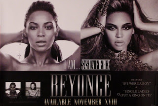


Beyonces magazine advert is of course, visually attractive and appealing however as a result of the dull colours., the advert fails to grab the audiences attention.

Although this is not a magazine advert but for a tour, Rita Ora's advert is definitely one of our favourites. This is due to the bold, bright colours and sizing of the font which immediately grabbed our attention. Rita Ora is the focal point, placed in the middle of the advert which makes sure that it is known it is her tour. The MTV logo is placed at the top of the screen so that the target audience knows who her record label and can easily identify her genre of music.

Taylor Swifts album advert was not particularly eye-catching. Although it uses the same features as Rita Ora's e.g. Bold, Large Font it is not as visually attractive. The vocal point of the advertisement should be Taylor swift, however the mid shot is not very effective and does not draw the audiences attention. If the shot were to be a close up of Taylor Swift with a more interested facial expression and location, it may have a greater impact.
Calvin Harris' album advert immediately caught Lauren and I's attention. We believe that this is due to the yellow background which is such a bold and interesting colour which you would naturally be drawn to look at. The image, although unusual is very unique and orders our attention.

Comments
Post a Comment