Posts

Showing posts with the label Magazine Advert Research

Ancillary Task 1: Magazine Advert
Image
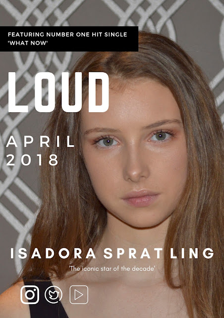
After creating two different Magazine adverts on canva we showed a number of people and received some audience feedback. We were told that they didn't like the font of the title as it didn't really fit with the genre or aesthetics of our music video, however we also learnt from our audience feedback that the writing in the first option covered to much our the image and in particular the artists face. Subsequently, we used the good aspects of both and combined them creating a magazine advert out target audience liked.

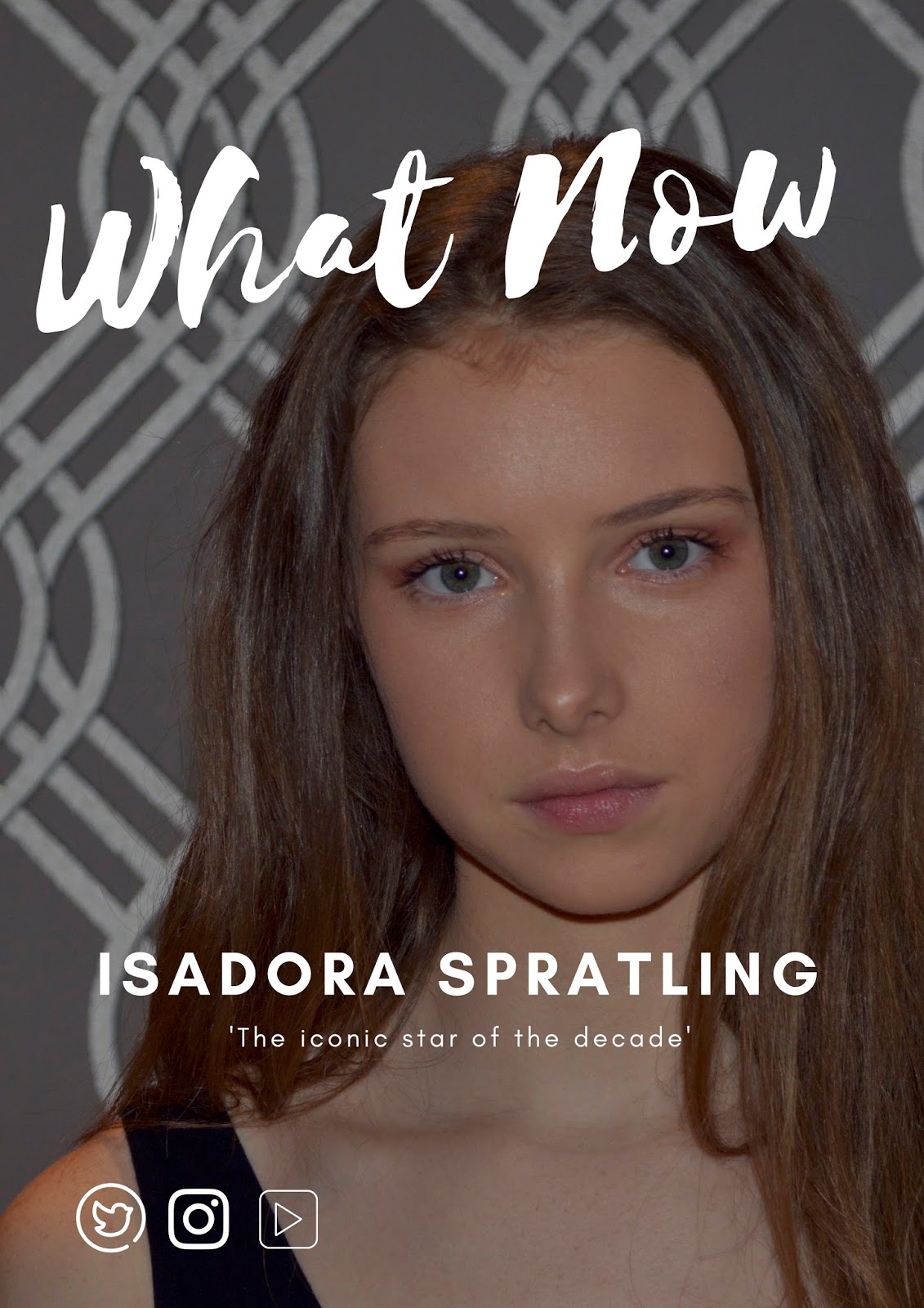
Ancillary Task 1: Magazine Advert

Image
After creating two different Magazine adverts on canva we showed a number of people and received some audience feedback. We were told that they didn't like the font of the title as it didn't really fit with the genre or aesthetics of our music video, however we also learnt from our audience feedback that the writing in the first option covered to much our the image and in particular the artists face. Subsequently, we used the good aspects of both and combined them creating a magazine advert out target audience liked. This will help us create a synergy with our website as we will use similar font and colours. 
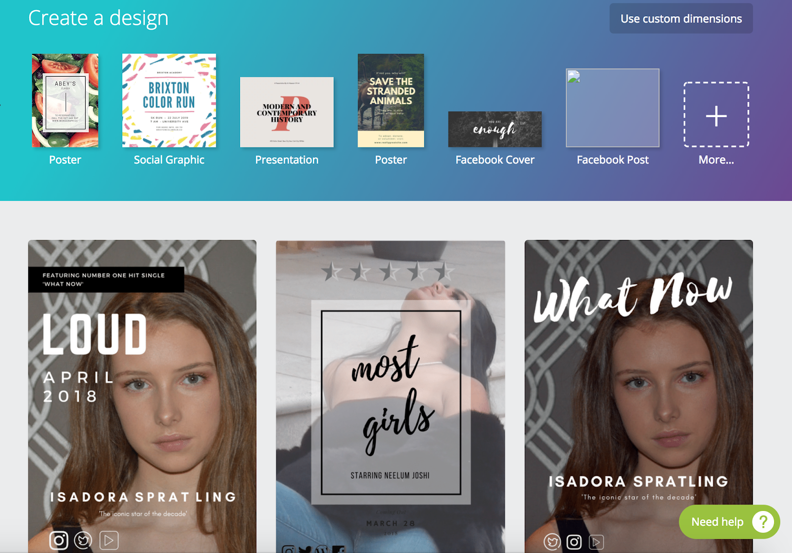
Magazine advert options

Image
Grace and I created 2 different magazine adverts as part of our ancillary task. We used the online website 'canva'. This website was really useful as it allowed us to choose from a range of different templates, which we could then edit and adapt to create something in keeping with out music video. We created two to give us options and a larger range of choice. However after receiving audience feed back we were told one was too plain and simple and the other ones writing almost ruined the image. Therefore we will try and create another with similar ideas however also take on board our audience feedback.

Change in Magazine Advert Plan!

Image
Grace and I today tried to use photo shop! We tried to remove the background, edit the photo and put a professional font on the photo but we did not like it. We found that the removing of the background and replacing it with colour looked unproffesional, and took the focus away from our protagonist. Therefore we found a new website called 'Canva'. On this website we used a template to create several magazine adverts which looked more professional.

Font and colour choices

Image
This is Grace and I's final font and colour choices. We have three chosen fonts, of which our main font is 'Norwester', with 'Montserrat' and 'Glacial Indifference'. We chose the colour scheme of black and white as it looks professional and clean.

Text on my magazine advert

We have decided that we want our magazine advert to state: 1. The name of our protagonists album - Loud 2. The date of release - April 2018 3. 'Featuring number 1 hit single - 'What Now'' 4. Protagonists name - Isadora Spratling 5. 'iconic star of the decade'

Photo Shoot

Image
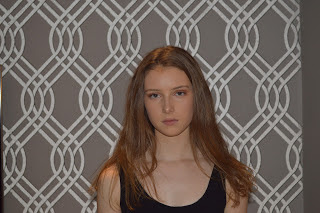
During our filming session we took a number of shots, which we intend to use for our website and magazine advert. These shots included images of Isadora dancing, as well as close ups of her face. Having done a lot of research into what makes an effective website, we realised how crucial good quality images were, therefore used a Nikon D3400 to produce the best quality images we could. 

Photo Editing Plan

Grace and I planned to have our magazine designed and created by the 2nd July. We plan to use photos we took of our protagonist while filming and upload them to photo shop. We were thinking of removing the background of our photo and replacing it with a block colour, with bold writing stating our artist and their album name, with her social media along the bottom.

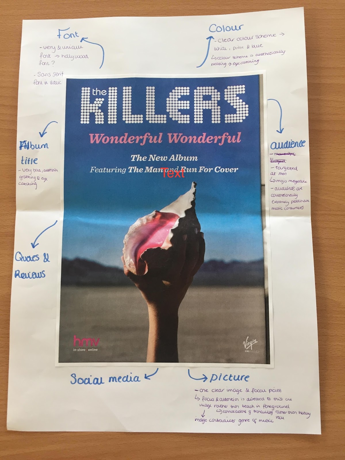
Analysing Magazine Adverts

Image
The Killers  Rolling Stones 

Magazine Advert Research

Image
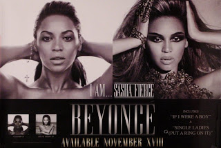
Typically, music artists like to use magazine adverts to promote their new music album or their tour. As well as creating a website, Lauren and I would like to create a magazine advert for our performers album and decided to do some research to help us. Beyonces magazine advert is of course, visually attractive and appealing however as a result of the dull colours., the advert fails to grab the audiences attention. Although this is not a magazine advert but for a tour, Rita Ora's advert is definitely one of our favourites. This is due to the bold, bright colours and sizing of the font which immediately grabbed our attention. Rita Ora is the focal point, placed in the middle of the advert which makes sure that it is known it is her tour. The MTV logo is placed at the top of the screen so that the target audience knows who her record label and can easily identify her genre of music.  Taylor Swifts album advert was not particularly eye-catching. Although it uses t...